
Logos rarely reach their optimum form at the first attempt. More often than not, they evolve with experience, with subtle refinements reflecting changes within the business over time. On the eve of DSD’s 17th birthday, I thought it would be interesting to revisit the evolution of our logo, reflect on how it has developed over the years, and consider its longevity, having remained unchanged in its current form for the past decade.
.
Pre-DSD, the racing years…
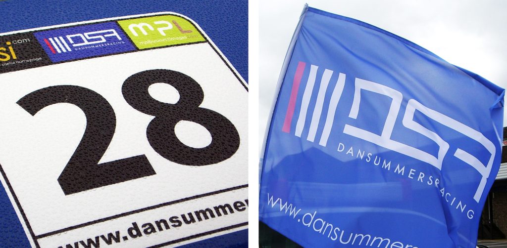
Two years before DSD launched, a similarly styled identity existed in the form of DSR. Dan Summers Racing (DSR) represented our race team during a seven-season stint in a national motorsport series called Stock Hatch. The logo featured the distinctive, continuous monogram style that remains recognisable in today’s DSD hexagon, alongside four vertical bars representing the team members.
.
.
The launch, going it alone…
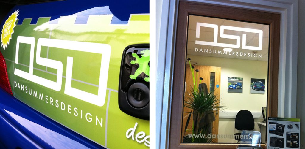
On Monday 26th October 2009, DSD was formally launched with a subtle redesign of the DSR logo. Only minimal changes were needed, laying the foundations for a closely connected family of brands. The continuous, interlocking letterforms were retained to communicate DSD’s single point of contact for clients, from the initial briefing through to final artwork delivery..
.
.
Rebrand, the evolution…
In April 2016, DSD moved into its second studio, within the prominent Safestore building on the gateway roundabout to Dukes Park Industrial Estate in Chelmsford, Essex. The move called for new stationery and studio signage, providing the perfect opportunity to review and evolve the brand.
The aim was to bring the DSD monogram together within a distinctive, memorable mark, with a hidden meaning at its heart.
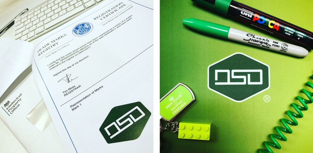
After considerable development, the hexagon was chosen to frame the monogram, representing balance, harmony and natural efficiency. Rather than pursue geometric perfection for its own sake, the proportions of the original lettering took precedence, allowing the hexagon to complement the monogram rather than dictate its form.
The resulting badge gave DSD a stronger, more self-contained identity: a seal of approval that could stand alone, while remaining simple enough to reproduce across a wide range of materials and at any scale.
And the hidden meaning? The four angled edges at the top and bottom of the hexagon are set at 26 degrees, a subtle nod to 26th October, the date DSD was officially founded in 2009.
.
.
Registration, making it official…
The following year marked another significant milestone in the evolution of the DSD identity. In May 2017, an application to register the logo as a trademark was submitted to the Intellectual Property Office (IPO), beginning a two-month period of public review.
In the meantime, the ™ symbol was added to the logo to indicate that trademark registration was being pursued. The application process was straightforward and relatively inexpensive, with the most challenging part being the decision over which classes of goods and services best represented the business. Fortunately, the staff at the IPO were knowledgeable, helpful and exceptionally friendly throughout the process.
Receiving the registration certificate in July was a hugely proud moment. The addition of the ® symbol to the DSD identity marked the culmination of the process, giving the logo formal recognition as a registered trademark and providing greater confidence in its legal protection. It was also a satisfying moment of ownership: a distinctive identity, developed over years of design and refinement, was now officially registered to DSD.
.
Expansion, continuing to adapt and develop…
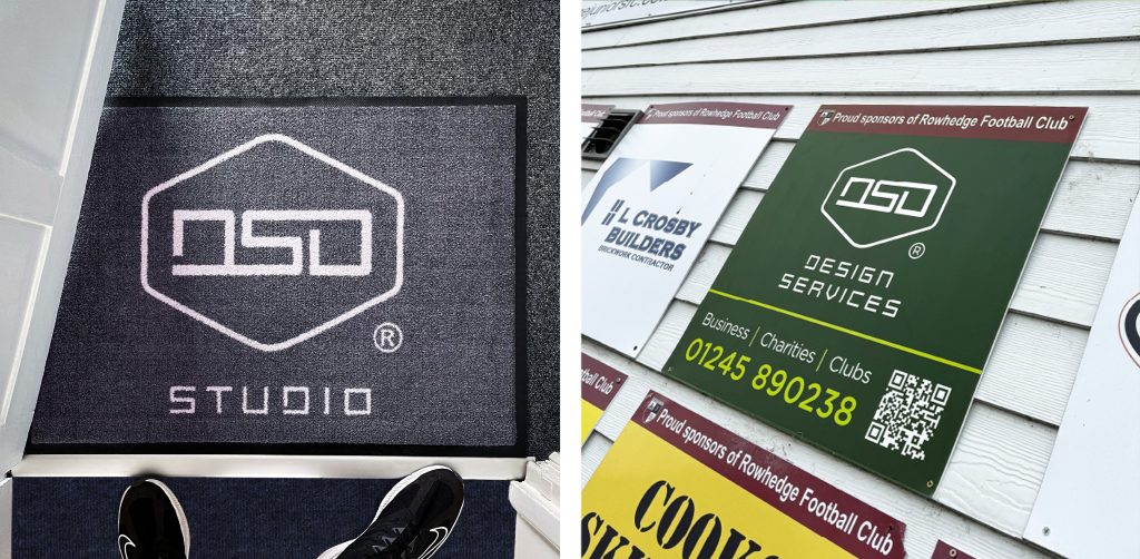
In more recent years, the logo has been complemented by bespoke typography developed from the monogram itself, creating variations for different uses. Within the studio, the DSD Studio identity has appeared on vinyl graphics and entrance mats, while DSD Design Services has been used on sponsorship materials for motorsport and football teams. These adaptations maintain the consistency of the core identity while allowing DSD to respond to different environments and contexts.
.
.
Looking to the future…
Almost ten years on, and with 2027 approaching, the time will soon come to renew the trademark registration for a second decade. Would I change anything about the mark? Probably not. As an identifier, it tells the 17-year story of DSD; one that I remain immensely proud of.
